Chosen theme: Matching Color Palettes with Furniture Styles. Discover how your sofa, table, or vintage chair can guide every paint choice, accent, and textile, so your rooms feel cohesive, personal, and alive. Join the conversation, subscribe for fresh palettes, and share your experiments with our community.

Decode the Color DNA of Popular Furniture Styles

Mid-century modern furniture, with walnut and teak frames, loves mustard, teal, and burnt orange balanced by soft off-white. Brass accents warm the palette, while graphic shapes keep it lively. What mid-century color combo has worked best for you? Tell us below and inspire others.

Decode the Color DNA of Popular Furniture Styles

Scandinavian pieces pair beautifully with whites, light ash, and dove gray, complemented by muted blues and whisper-soft sage. Linen upholstery, bleached oak, and matte black details create calming contrast. If you crave serenity, this palette sings. Comment with your favorite soft neutral mix for cozy, bright mornings.

Decode the Color DNA of Popular Furniture Styles

Industrial furniture thrives alongside concrete gray, gunmetal, and tobacco leather, sparked by brick red or rust. Charcoal textiles, black steel, and warm Edison bulb light prevent the look from feeling cold. Want sample combinations for lofts or studios? Subscribe for palettes tailored to raw, rugged textures.

Start with a Hero Piece, Build the Palette Around It

If your anchor sofa is deep-blue linen, pull a lighter slate for walls, camel leather for warmth, and brushed brass for glow. Add a patterned cushion that mixes blue and camel to bridge tones. Share your sofa hue, and we will suggest two accent colors that instantly elevate it.

Start with a Hero Piece, Build the Palette Around It

A vintage rug’s pattern offers direction: choose two dominant colors and one whisper shade for accents. Repeat the darkest tone in a sideboard or lamp base, and echo the softest in curtains. Post a photo of your rug pattern, and the community will crowdsource perfect pairings.

The 60–30–10 Rule, Tailored to Each Style

Try 60 percent warm cream walls, 30 percent mahogany and chocolate leather, and 10 percent forest green in pillows or drapery trims. The result honors traditional furniture shapes while feeling fresh. Which accent would you choose—emerald, burgundy, or navy? Vote in the comments to guide next week’s palette.

The 60–30–10 Rule, Tailored to Each Style

Go 60 percent soft gray walls, 30 percent white oak and sand upholstery, and 10 percent cobalt or coral for pop. Sleek furniture lines appreciate disciplined color. Swap cobalt for terracotta if you prefer warmth. Subscribe to get printable swatch cards for quick store visits and stress-free decisions.

Light, Texture, and Finish: The Hidden Variables

Daylight and Bulbs

North light cools blues and grays; south light warms creams and woods. Warm LEDs flatter walnut and leather, while neutral LEDs help balance cool Scandinavian palettes. Always test swatches near your furniture. Comment with your room orientation, and we’ll suggest “safer” whites that won’t surprise you at night.

Texture and Sheen

Matte paint hides imperfections and complements rustic or industrial furniture; satin adds durability near dining chairs; high-gloss magnifies mid-century curves. Textiles matter, too: boucle softens modern lines, velvet enriches classics, and linen cools Scandinavian pieces. Ask us which sheen suits your table finish and daily wear.

Small-Space Illusions

Pale, near-monochrome palettes make tight rooms feel open, especially with slim-legged furniture. Mirror the furniture’s wood tone in small doses, and keep contrasts gentle. A single bold accent prevents blandness. Tell us your square footage, and we’ll tailor a forgiving palette that still shows personality.

Stories from Real Homes: Palette Wins and Lessons

A reader paired industrial metal stools with a storm-gray wall and felt the room shrink. We switched to a soft greige and added caramel leather cushions. The stools finally felt intentional. Share your before-and-after, and we’ll feature the best palette pivots in our next newsletter.

Stories from Real Homes: Palette Wins and Lessons

An heirloom oak table clashed with icy gray walls. We warmed the space using mushroom paint, olive linen runners, and aged brass candlesticks. The traditional furniture looked proud, not dated. Post your heirloom piece, and our community will recommend three modern, respectful color companions.

Common Pitfalls and How to Fix Them

When furniture wood, flooring, and cabinets are identical in tone, the room looks flat. Introduce a contrasting metal or a cooler textile to break monotony. Try a rug that bridges both temperatures. Tell us what you are over-matching, and we’ll propose a simple, two-step fix.

Common Pitfalls and How to Fix Them

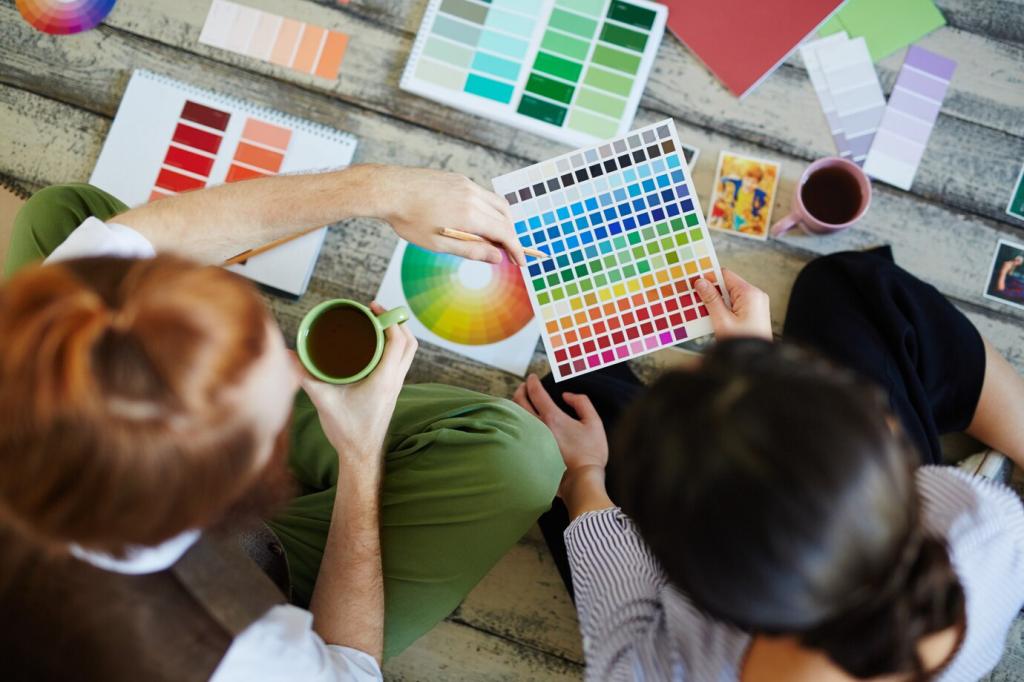
Scandinavian palettes can feel chilly; traditional palettes can get heavy. Balance cold blues with warm brass and honey woods, or temper deep reds with cooler stone grays. Post your current trio of colors, and we will recommend one balancing metal and one grounding neutral.

Swatch Wall Challenge

Paint three postcard-sized swatches near your furniture; observe morning, afternoon, and evening. Place a cushion or wood sample against each. Eliminate the liar under evening bulbs. Share your winner in the comments, and subscribe for a downloadable tracker to make decisions faster.

Style-Swap Mockup

Photograph your room, then drop in two alternate furniture styles with free design apps. Test the same palette against both styles. You will instantly see which colors are versatile. Post screenshots, and we will vote on the most cohesive match and suggest subtle palette tweaks.

Community Check-In

Upload a snapshot of your trickiest corner and list three colors you love. We will propose a 60–30–10 that respects your furniture style. Join our newsletter to receive seasonal palette updates and real reader makeovers for inspiration driven by authentic homes like yours.
Natueflix
Privacy Overview

This website uses cookies so that we can provide you with the best user experience possible. Cookie information is stored in your browser and performs functions such as recognising you when you return to our website and helping our team to understand which sections of the website you find most interesting and useful.