Chosen theme: The Role of Lighting in Color Choices. Light can flatter, distort, and completely reinvent a color. Here we explore how daylight, LEDs, and angles transform what you see—so your palette sings in every room. Share your lighting challenges and subscribe for practical color tests you can try tonight.
Warm light around 2700–3000K deepens reds and creams, while cooler 4000–5000K sharpens blues and grays, shifting how colors feel and read. Test under both before deciding, and tell us which Kelvin range makes your favorite hues come alive.
Color Rendering Index (CRI) and Truthful Tones
A high CRI light, ideally 90 or above, closely reveals a color’s true character by offering a fuller, more balanced spectrum. If your green looks dull, your lighting may be the culprit. Share whether high-CRI lamps improved your paint or textile choices.
Metamerism: The Sneaky Chameleon
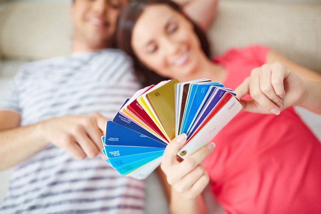
Metamerism occurs when two colors match under one light but clash under another. It’s why that perfect beige turns pink at night. Always examine swatches under daylight, warm LED, and cool task lights. Try it this week and report your surprises.
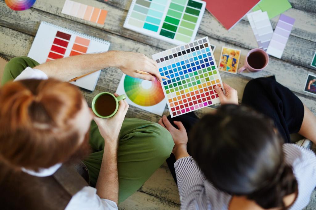
Paint foam boards with two coats and edge them with white tape to reduce color contamination. Move them between walls and times of day. This mobile testing reveals how lighting and orientation transform undertones. Post your most surprising morning-versus-evening comparison.
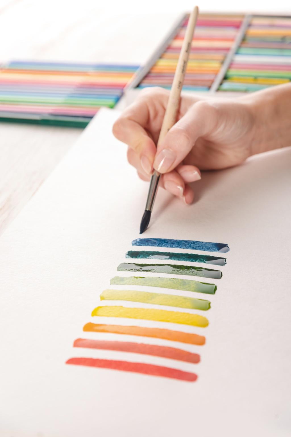
Photograph and Compare
Shoot samples with consistent angles, then review images side by side. Lock white balance or use a gray card to avoid camera bias. You’ll catch subtle shifts the eye normalizes. Try this method tonight and tell us which hue behaved differently than expected.
Live With It for Forty-Eight Hours
Tape swatches near lamps, windows, and corners. Note feelings at breakfast, afternoon, and midnight. Colors that delight at dusk might feel heavy by noon. Keep a brief journal and comment which moments made or broke your final color decision.
Lighting and Color in Digital and Brand Spaces
A boutique’s warm, low-CRI lamps turned their cool-denim line muddy, driving returns. Switching to high-CRI 3500K restored crisp blues and customer confidence. If your store colors feel off, audit lighting first. Comment if better lamps ever saved your merchandising.
Emotions, Culture, and the Psychology of Lit Color
Cozy Dinners vs. Focused Studios
At 2700K, terracotta, caramel, and earthy neutrals feel intimate and welcoming. At 4000K, slate and teal read cleaner and more precise. Share the lighting and color pairing that made your dining room cozier or your studio sharper and more productive.