Chosen theme: How to Choose a Color Palette for Your Living Room. Today we’ll blend color theory with real-life habits, light, and stories so your living room feels as good as it looks. Share your questions, subscribe for weekly palette inspiration, and let’s start crafting a room that reflects you.
Do you crave calm, focus, or a welcoming buzz for gatherings? Write down one core feeling and two supporting words, then choose colors that naturally evoke them. Comment with your three words so we can suggest tones.
Map Colors to Daily Routines
If you read in the mornings, airy hues can lift energy; if evenings mean movies, deeper tones add intimacy. Match color temperature to your routine moments, and tell us when your living room shines most.
Choose a Style Anchor
Cozy Scandinavian, breezy coastal, or refined mid-century? Select one style anchor and let it narrow your palette family. Post your style anchor below, and we’ll share specific hue families that fit beautifully.
Light, Undertones, and Space
Read the Light Like a Designer
North light cools colors; south light warms them. East gives crisp mornings; west glows golden at dusk. Test swatches on multiple walls and share a photo; we’ll help interpret shifting light in your room.
Spot the Hidden Undertones
Whites can lean pink, blue, or green; grays hide violet or taupe. Hold swatches against pure printer paper to reveal undertones. Drop your tricky swatch combo in the comments for crowd-sourced clarity.
Size and Proportion Matter
Small rooms feel larger with higher-LRV colors that bounce light; expansive spaces welcome saturated hues without feeling heavy. Measure your room, note window size, and ask us about ideal LRV ranges to try.
Start with a versatile neutral for walls or the largest surfaces. Soft greige, creamy off-white, or warm oatmeal can ground bolder choices. Tell us your flooring tone, and we’ll suggest a compatible base neutral.
Select a Confident Main Hue
Pick a color that reflects your mood word—sage for calm, terracotta for warmth, ink blue for depth. Tie it to textiles or a rug. Share your main hue idea, and we’ll offer two nuanced shade alternatives.
Add an Accent with Personality
Accent colors shine on pillows, art, lamps, or a single chair. Think mustard, coral, or forest green. Commit in small doses, test, then scale up. Comment which accent speaks to you, and get mix-and-match tips.
Choose a hero piece with multitone depth, then sample three shades from it: background, mid-tone, and a small accent. Tell us your hero item, and we’ll help translate its colors into wall and fabric choices.
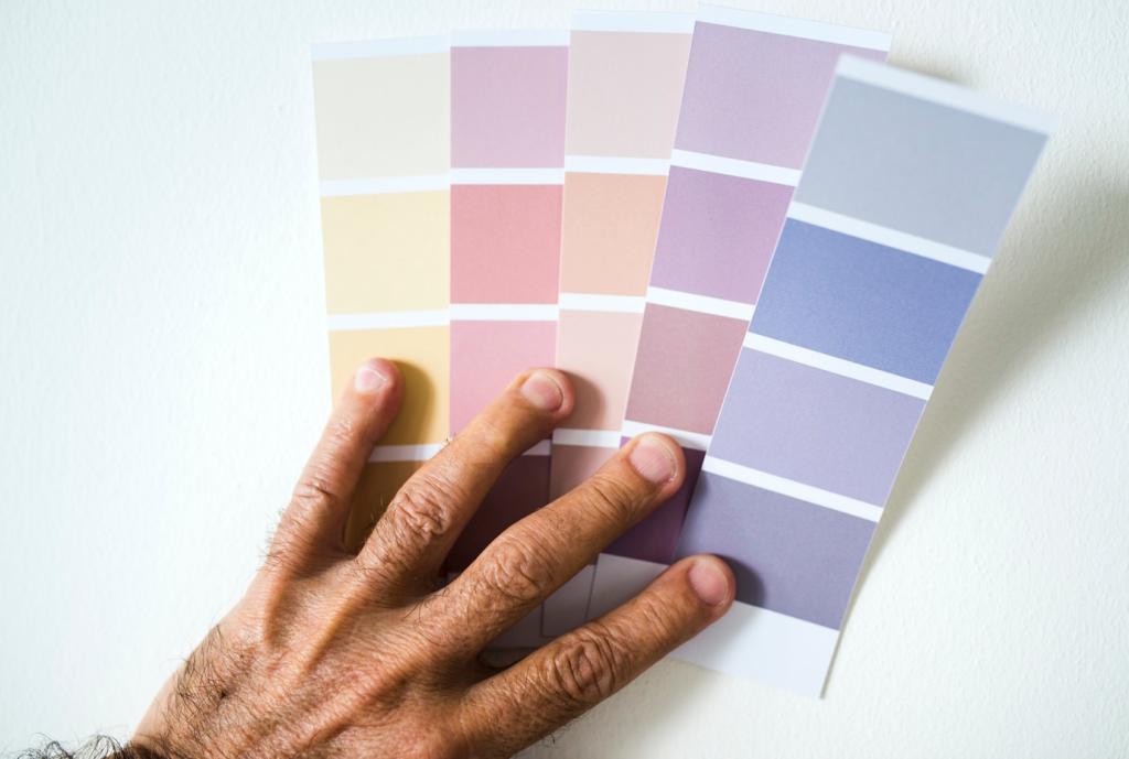
Paint letter-size sheets or peel-and-stick swatches and move them around. Large samples reveal undertones and sheen differences. Show us two contenders side-by-side, and we’ll help you see subtle shifts clearly.
Maybe blue recalls seaside summers, or marigold celebrates family festivities. Let memories steer subtleties. Share a color tied to your story, and we’ll suggest a gentle way to weave it into your living room.
Swap throw covers, add a new plant, rotate art, or change lamp shades to shift temperature. Post a before-and-after; we love highlighting budget-friendly refreshes that keep your palette feeling alive and intentional.
Record paint names, LRV, sheens, and fabric codes in a note. Future you will thank present you. Upload your palette card and subscribe to get printable templates and monthly color cues straight to your inbox.